Investigating An Object’s Velocity Graphically
The first year students began this week to investigate velocity vs time graphs for moving objects. I start the Constant Acceleration Particle Model by having the students analyze these graphs first. This is a bit different than how I used to do this, but I think it works better because it allows the students to make several observations about an object whose velocity is changing and it introduces an interesting new way to see graphs of rates vs time.
First, the students repeat the constant velocity investigation with the buggies, but this time we look at the velocity vs time graph created by LoggerPro. They see that the velocity is not perfectly constant, but that the average velocity is very close to the slope of the position vs time graph. This once again validates our understanding of the slope as being the average velocity.
What Does The Integral Button Do?
Without explaining anything about what that “Integral” button does in LoggerPro, I ask the students to simply give it a try. They see that the area under the graph is filled in with a solid color. I point out that LoggerPro associates a numerical value to this area. I ask the students to look closely at the units.
They get a bit confused with “s*m/s”, but that allows me to strengthen their understanding of how dimensional analysis works. Eventually everyone in the room agrees that this reduces to just meters. So the next question is “what meters?” What is this a measurement of?
They immediately suggest that it might be how far the buggy traveled in this time. The students check this and with a high degree of accuracy, it appears that this is indeed what the area represents! Cool, a new way to look at graphs.
From Rectangles to Triangles
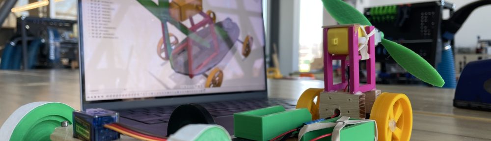
The next step is to move onto an object that is accelerating at a constant rate. The students use the motion detectors to now look at a cart being pulled by a small weight that is attached to a string – what is called a “modified Atwood’s machine”. After collecting the velocity data and graphing it, the students once again use the linear regression tool to find the slope of this graph.
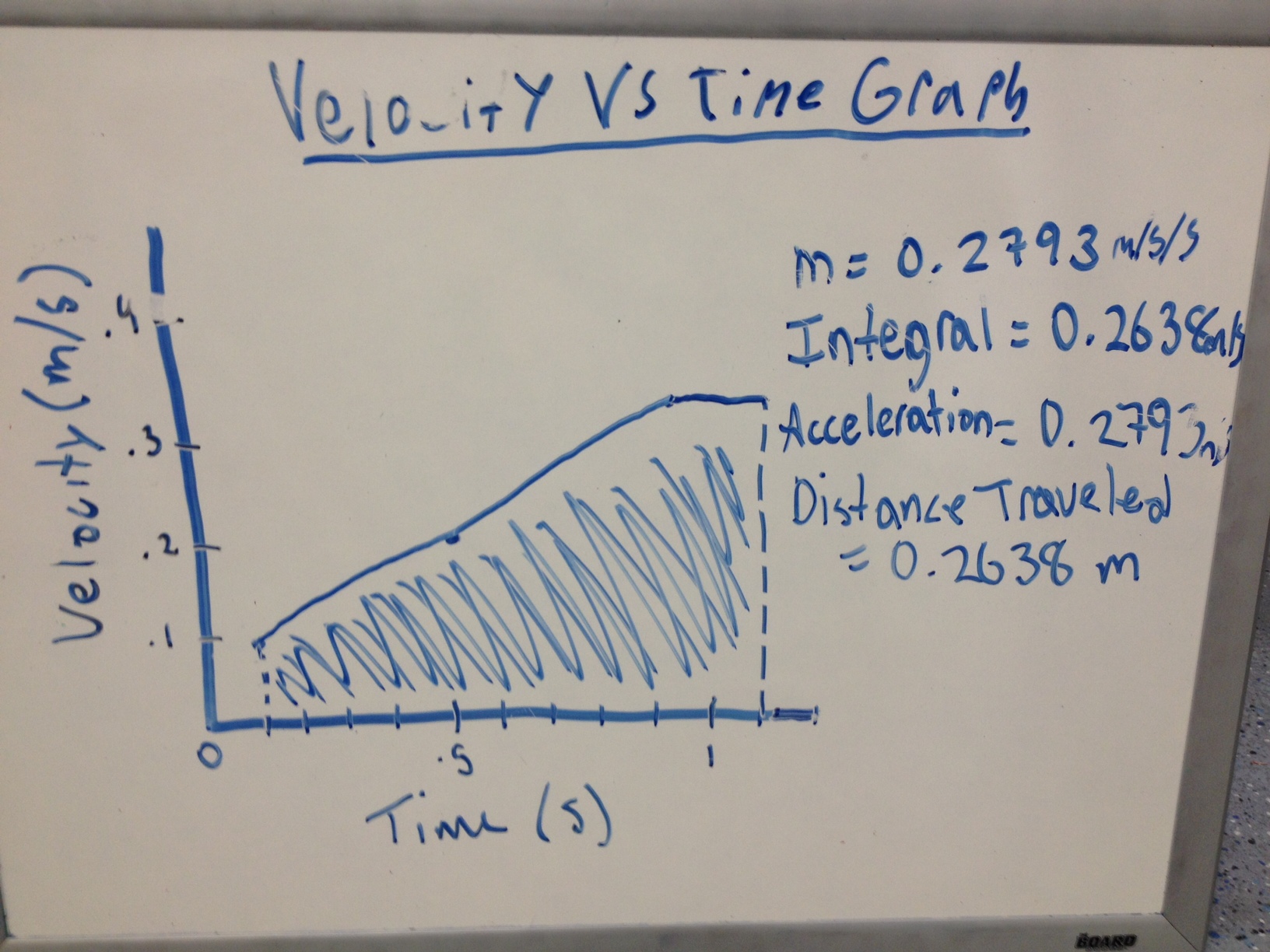
This allows us to discuss what the slope of this graph represents. Once again we get into a discussion of units because the units identified on the graph are m/s/s. The students see that this slope is actually describing the rate at which another rate (velocity) is changing.
We then use the integral tool again for the case of an accelerating cart, and it appears to work really well (see the above picture). Students share out on their whiteboards the graphs they observe, with the slope and integral value identified. The class seems pretty convinced that these quantities represent the characteristics of the observed phenomenon, so we are off to our first deployment…
