We Have Lift Off!

15414703973_b0258a08ca_h  15846865828_b08d8515cd_h 16033503742_be978fd9ca_h

This is a follow up post to Modeling A Rocket’s Journey – A Synthesis where I described how the students in the first year program were engaged in creating a predictive report for their model rockets. I want to emphasize that these model rockets were not kits. Each rocket was designed using 3D CAD software, and each component was either fabricated from raw material, or was created from material that was not intended for use in model rocketry. The only exception to this is the actual rocket motor.

The next step was to launch the rockets and have the altimeter payload collect altitude data.

Launch Conditions – A Bit Soggy

Unfortunately the week of our scheduled launch happened to be a week of some pretty hefty rains. We rescheduled the launch twice before finally accepting the soggy launch conditions. With umbrellas and rain jackets, we trudged out to the baseball diamond and got to work setting up for the launch. We had some minor difficulties in the wet weather, but eventually had a very successful launch day.

Most of the rockets were able to launch and deploy their valuable payload – the Pnut Altimeter.

15414689283_8197c70584_h

The students seemed very excited to finally see the rockets launch, and to see the successful deployment of the parachutes. Although we all got a little wet and muddy, we had a great time!

The Altimeter Data

The altimeters use a small barometric pressure sensor to collect altitude data (the altimeters also contain a small temperature sensor and voltage sensor). The altitude is recorded in feet every .05 seconds. Here is an example of one rocket’s recorded flight data:

altitude_vs_time

https://plot.ly/~stemples/9

The students were then asked to use the data to create a comparative analysis report. I will detail how the assignment was set up and also discuss how the students performed on this assignment. That will be for another post.

I want to also thank Mr. Kainz for his amazing photos that are displayed here.

Modeling A Rocket’s Journey – A Synthesis

A Synthesis Of All The Models (Thus Far)

In this post I will describe a culminating activity for the first year students in the Academy. This is really the destination that the students have been headed towards since the beginning of the course. Everything they have learned is synthesized in this activity where the students gather data from various observations/experiments and then use the data to predict their own model rocket’s journey.

Note: There were two significant simplifications that we had to make based on the ability level of the students and the physics content covered in class. We had to assume that there was no air resistance force acting on the rocket during the thrust and cruise phases. We also assumed that the mass of the rocket did not change. I intend to have the students reflect on how this might affect the predictions and then analyze the actual performance data. More on this later…

Measuring The Rocket Engine Thrust

We first needed to figure out the average force exerted by the rocket motor on the rockets and the time interval during which that force would be applied. This would give the students both the thrust force and the length of time of the thrust phase. We needed to collect force measurements for the rocket motors that we were using (C6-5). You can actually download this from many different websites, but it was much more fun to actually do it ourselves! Mr. Holt made a neat little rocket motor holder that was attached to a force meter and we went out into the rain to test the motor (see video below – thank’s Gary!):

The force data was then shared out to the students – here is what the graph looked like:

rocket-engine-test

And this is the force vs time graph one retailer posted on their website:

Although the students had not been introduced to the concept of Impulse-Momentum transfer, we can use the average force, and that seems to work out really well. Just to make sure we could do this, I used the Integral tool in LoggerPro to measure the impulse, and it came out to 8.83 N s – really close to what Estes states – 8.8 N s.

A Mini Wind Tunnel Test

The students then needed to measure the drag force on their parachutes (all cut on our new laser cutter) as a function of air speed so that they could estimate the terminal velocity of their rocket during the descent phase.  Next step was to test the parachutes. Luckily, Mr. Holt and I had helped two of our previous students create a really nice wind tunnel. We used a force meter attached to a vertical post inside the tunnel…

parachute_test

…and then we used a little Kestrel anemometer to measure the air speed…

air_speed

Students were able to increase the air speed in the tunnel by turning a rheostat that controlled the fan speed. They then measured the wind velocity and graphed that against the measured force – just like NASA!

Here is some sample data to show how the results came out – not bad!

parachute-test-data

Students now had a way to estimate the descent velocity because they could calculate the gravitational force on their rocket, using the measured mass of their rockets, and then they could use their data to find the corresponding wind speed.

Putting It All Together

As part of their final (50%), the students were asked to then take this data, measure the mass of their model rocket and construct a prediction. The prediction was to include these five elements:

  1. A set of force diagrams for the different phases – thrust, cruise, and descent. The diagrams also had to include accompanying net force equations.
  2. An acceleration vs time graph.
  3. A velocity vs time graph.
  4. A position vs time graph.
  5. Finally a calculation sheet that includes all calculations required to create the motion graphs.

The students have been asked to turn this in before the actual launch.

As we collected the data above, I never explicitly reveal how the data should be used to make these predictions, but I do give them some guiding questions that orients them. They work with their partner’s on this report, but I warn them that they will both be held responsible for understanding the process of creating the prediction report.

Testing the Predictions

Each student rocket will be equipped with a small altimeter (from Apogee Rocketry – love this thing!).

This altimeter records altitude data in 1/10 of a second intervals, and we have found it to be very accurate and reliable. We will be launching next week, so tune in soon for an exciting update on how the launches went!

Building The Net Force Particle Model (Part 1)

From “The How” to “The Why”:

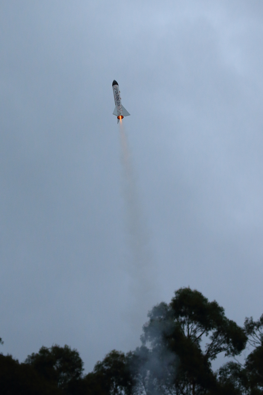
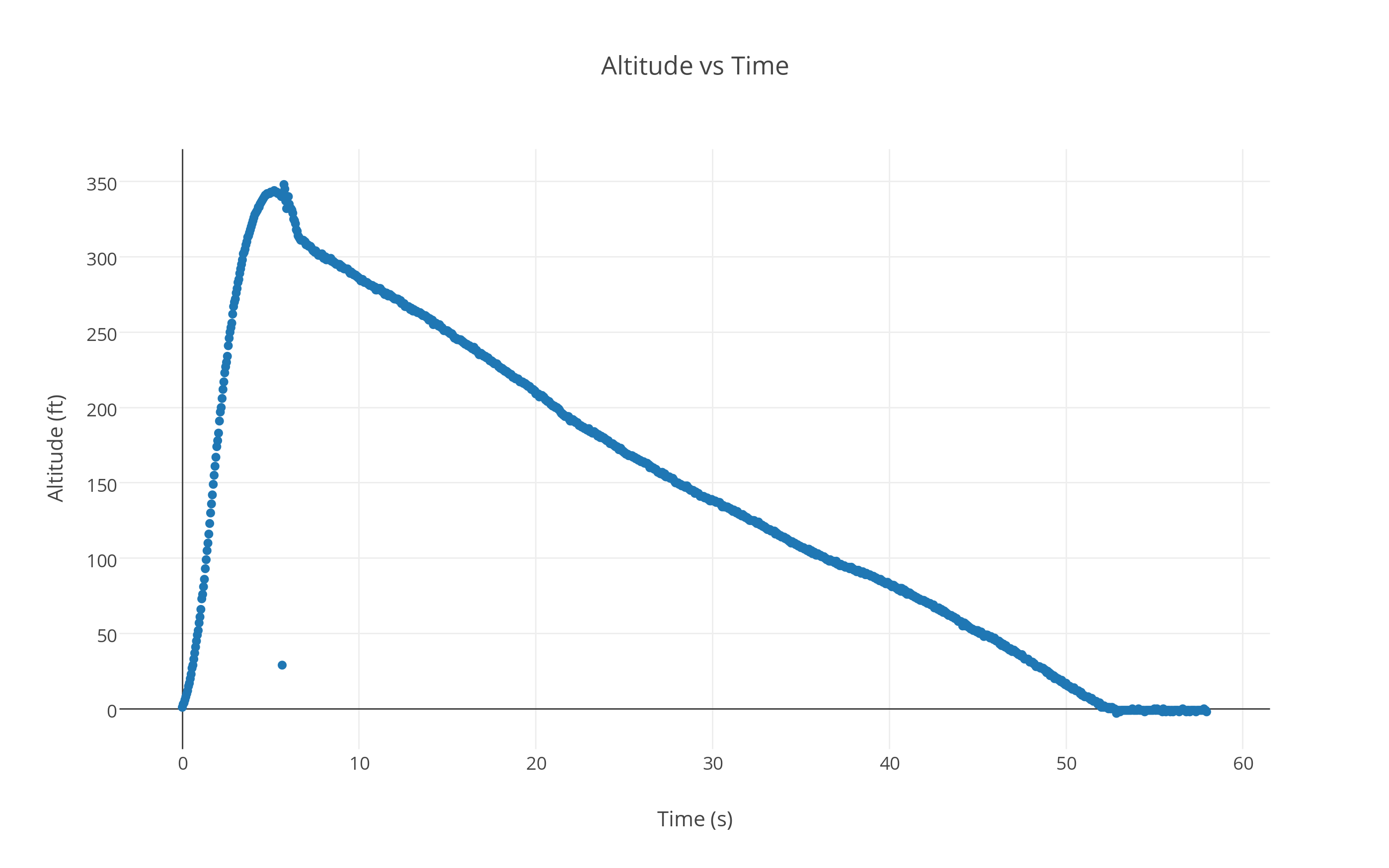
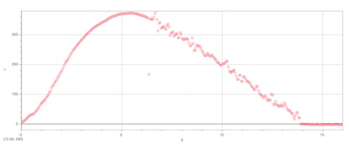
One of the three projects that the students will complete this year is a custom designed and fabricated rocket. One of the requirements of this project is for the rockets to carry a small solid state altimeter that collects vertical position data. This year I decided to give the students some data collected by last year’s students. Here is what the data looks like from one typical altimeter reading:

Rocketdata2013

As an introduction to this next model, I presented them with the data and asked them to use both the Constant Velocity Particle Model and the Constant Acceleration Particle Model to describe the motion of the rocket based on the data. Students responded to several questions that I created and they posted their answers through the Learning Management System we use.

A Simple Definition, A Simple Representation

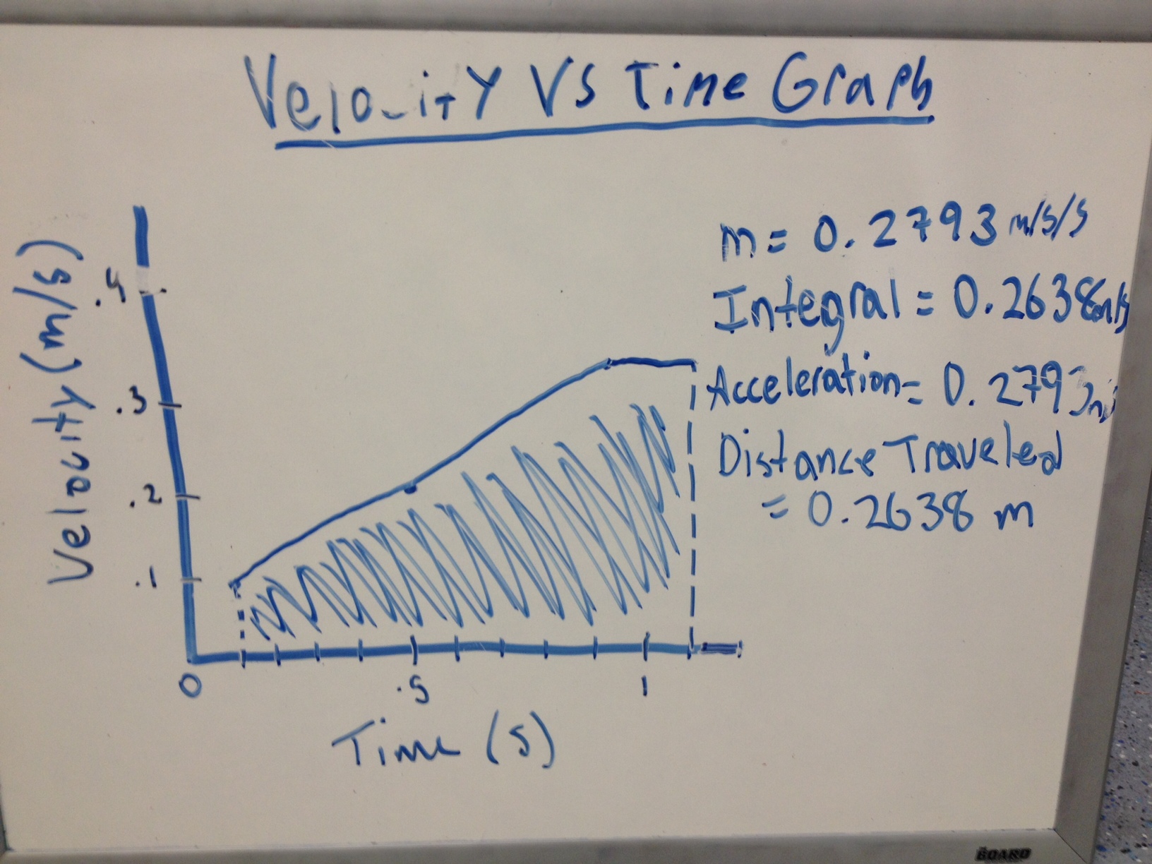
The student investigation teams were then asked to draw velocity vs time graphs on their whiteboards. I was impressed to see that most teams were able to interpret the position data and create a velocity graph that agreed with the data. There was some debate about the graphs, but the students worked through these differences and came to consensus around what the graph would most likely look like. At this point I was thinking about using LoggerPro’s ability to graph the derivative of a data set, but decided that I would leave that for a later date, though next year I might do it earlier.

I then introduced a very basic definition of a force:

“A Force is A Push or A Pull”

And then I proposed that we could represent the force with an arrow, just as we had done with velocity and acceleration. I then asked them to divide the rocket data into four sections based on the answers to the questions we had discussed. The students then drew a representation of the rocket in each stage and the forces acting on the rocket. The stages the students identified were 4) on the ground, 3) descending by parachute, 2) going up without fuel, and 1) going up with fuel. I asked them to draw the diagrams by starting at the end. Here is a typical example of the force diagrams the students drew:

photo 2

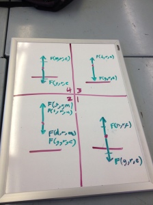
The labeling is a standard that is outlined in the Modeling methodology – it reads (type, feeler, dealer).

Constant Velocity Motion and Net Force

We started the class discussion by looking at the forces acting on the rocket when the rocket was on the ground. Students agreed unanimously that there were two forces acting on the rocket – one down, one up – the gravitational force and then the force from the ground. Great. Then on to the descent phase. Certainly less unanimity here. The students again agreed on the number of forces – two – one up from air resistance, one down from gravity. The students quickly got into several back-and-forth arguments about the length of the force vectors. The class was split. Were the forces equal? Or, was gravity “winning”? The big stumbling block was around the question, “if gravity was equal to the air resistance force, then why was the rocket still falling”? A classic example of Aristotelian thinking. I encouraged them to ask the question – “if gravity was winning, why wasn’t the rocket speeding up?” One student proposed that maybe the force of gravity was just ever so slightly larger. Some students pounced in this. They argued that the forces weren’t equal at first, but as the rocket (with parachute) descended, the air resistance force strengthened and eventually became as strong as the gravitational force. the reason the rocket didn’t slow down was because it was already moving when the forces became equal. Awesome. Then a student gave an excellent description of a thought experiment where a box was traveling through space in one direction and convinced the students that the box would not slow down if you pushed equally on both sides of the box. Students reached consensus – the rocket moved at a constant velocity because the forces were equal.

The “Residue” Misconception

We then progressed to the next stage. Things got really interesting. Without exception, ALL the student groups identified an arrow pointing upward, even though they all agreed that the fuel had run out. The question that I think cuts through this the quickest is to ask “who is pushing on the rocket upward?” Most students get that funny look on their faces as their brains begin to realize that they just ran into a logical conundrum. Some students start to respond – “the rocket pushes the rocket.” OK, how? What kind of force is it? A contact force? How does it push or pull itself? The students at this point began to question each other and the room erupted in arguments. Being a bit of a control freak, I’ve had to learn to allow space and time for these chaotic moments, but also realize the importance of catching the class before it descends into something less productive.

At this point, one group erased the upward force. I asked them why they had done this. They responded that they didn’t think a force was needed for the rocket to continue upward, and that gravity and air resistance were slowing the rocket down. This seemed impossible to some of the students. They asked – “but something is left over after the fuel runs out, isn’t there?” The class began to divide up into those that now believed the rocket no longer had any upward force acting on it and those that believed there was some kind of “left-over” force, what I call a “residue”. So, once again, I asked them to identify the dealer of the residue force. The answer is generally – “the fuel”. Ah, but hasn’t the fuel run out? Yes, but the rocket has gained something from the fuel and now that is what is pushing it upward.

This is not such a wild idea, and in fact is not that far from the idea of Kinetic Energy. The students that were in the “no upward force” camp started to explain to the other students in the class that the fuel had “given” the rocket its upward velocity, but now that the fuel was gone, the rocket was now slowing down. We discussed the idea that anything that was slowing down must be experiencing a force pushing in the opposite direction of its velocity. We returned to the thought experiment with the box floating through space. The students debated about whether this box would slow down if the force that had gotten the box moving in the first place disappeared. The students agreed that if there were no forces acting on it to slow it, then it was reasonable to say that it would never slow down. Students then agreed the rocket was no different. It didn’t need a force to continue moving at a constant velocity, but that if it was instead accelerating (in this case in the negative direction) then it would need a force, which was provided by gravity and the air resistance force.  The students began to coalesce around the idea that if a force was a push or a pull, then the rocket that had run out of fuel was not getting pushed any longer, and that although it was moving upward it was indeed accelerating downward.

Making Some Observations

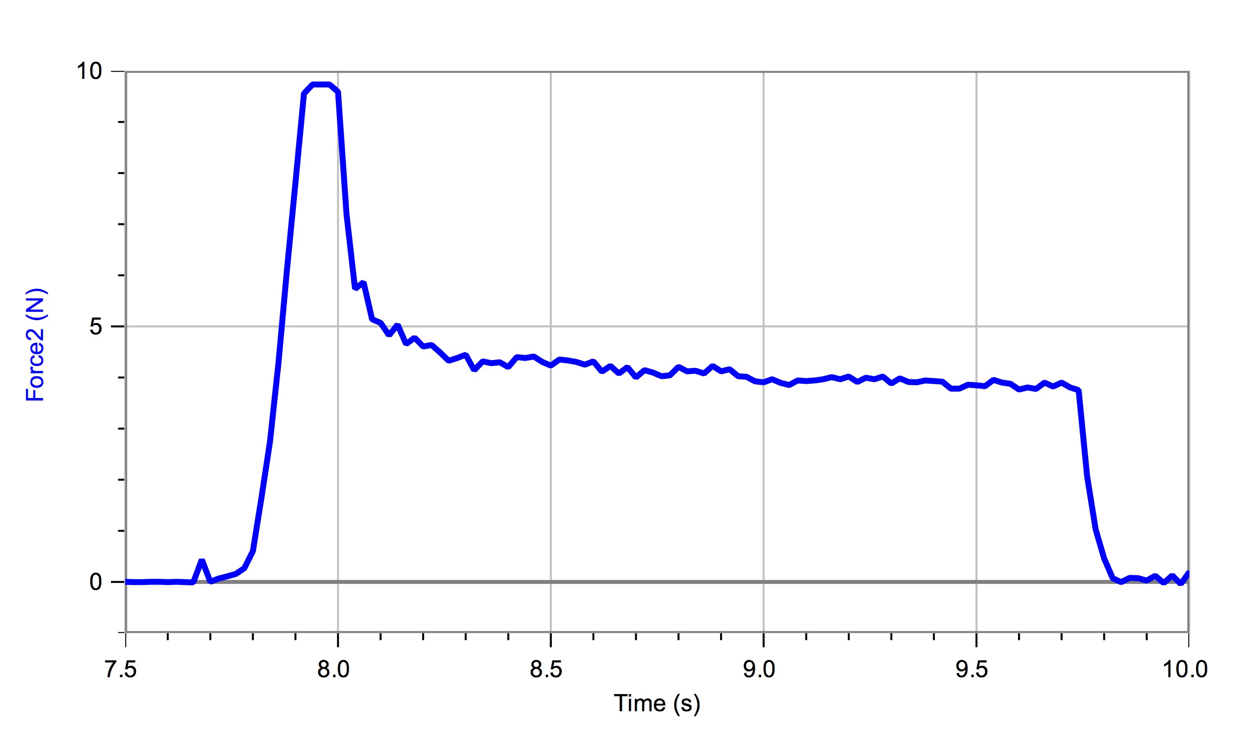
During the next class, I had the students set up a motion detector on one side of a Vernier dynamics track and use a force meter to pull on a low friction cart. They were to also record the velocity of the cart while the students pulled twice in quick succession on a string connected to the cart and force meter.

IMG_0686

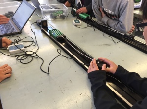
The students then shared their graphs with the rest of the class:

IMG_0687

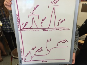
This experiment is meant to re-enforce some of the arguments made during the previous class. The students quickly see that the velocity is measured to change when the force is applied and that the velocity is “constantish” when no force is applied. The students were ready to tackle how the force and acceleration were quantitatively related, but that’s for another post…

Deploying The Constant Acceleration Particle Model (CAPM)

The APT 1 students just recently finished building and testing (deploying) the Constant Acceleration Particle Model. As stated in an earlier post on studying velocity vs. time graphs for a constantly accelerating particle, the students used these graphs to study how the velocity changed, but also how the graph gave the students a way to calculate the change in position of the particle.

Position vs Time Graphs and “Fitting The Function”

Using the Vernier Motion Sensors, the students then collected position data for a cart that was accelerated across the table at a constant rate (using a modified Atwood’s machine setup). This revealed what some of the students had expected – the graphs were curved!

At this point, I could have introduced the process of linearizing data as some other Modelers have done, and perhaps I will do that next year, but this year I went ahead and just asked the student to use the “function fit” tool in LoggerPro. This tool fits a mathematical model to the data, and then displays that model on the screen. I can see why some teachers feel that it is better to get the students to go through the process of linearizing the data because depending on the tool in LoggerPro can lead to some misunderstanding and it encourages the students to depend on the computer to “give them the right answer”.

What Do “A”, “B” and “C” Mean?

The reason I do introduce this tool is because we are going to use it in the future, and it gives me a reason to talk about the coefficients of the fitted function. So, immediately after the students see the fitted function, I direct them to desmos.com to have some fun with quadratic functions – and (re)learn how the coefficients in the quadratic function change the curvature of the graph and the location of the vertex. This allows us to get into a good discussion about how these coefficients are related to physical changes. I ask the students to consider the questions – “How would the graph have changed if the cart had a greater acceleration?” and “What if the cart had accelerated in the opposite direction?” and “What if the cart had started from a different location?”

Cart Jousting

Once they have a solid grasp of this function, and how it can be used to predict the position of an accelerating particle, I set them off on a deployment task – cart jousting!

The students set up two carts a distance of about a meter away from each other. Each cart was on its own track. Once again, a weight hanging on string that passed over a low friction, low mass pulley was connected to each cart. I gave the students different masses for each cart so that the carts would accelerate towards one another at different rates. The students were also asked to attach a pencil to the front of the cart so that the cart would visibly push the other cart as it passed. The students used LoggerPro one more time to get the slope of the velocity vs time graph so that they had the acceleration of each cart. Using the function that outputs the position of an accelerating particle, given a specific time value, the students were able to predict the point of collision.

When I have the students do this, as suggested by modeling pedagogy, it is really important to have the students explain the process by which they established their prediction. This is done on whiteboards. I don’t however have a class discussion unless I think it is going to help certain groups. Otherwise, I take on the role of Socratic inquisitor and allow the teams that are confident, to proceed with the experiment. This allows me to coach certain teams that I know might just otherwise wait to see what other teams have done, and simply follow them.

Students then have fun taking video and sharing the video to me. I’d like to set up some way for the students to post to a social media site, but I am a bit concerned that I would need to be the filter – something I have not yet found.

Well, now its time for us to turn our attention from strictly kinematic models to causal models that describe and represent causal relationships for answering the question – “why do things move the way they do?”

Investigating Velocity vs Time Graphs

photo

Investigating An Object’s Velocity Graphically

The first year students began this week to investigate velocity vs time graphs for moving objects. I start the Constant Acceleration Particle Model by having the students analyze these graphs first. This is a bit different than how I used to do this, but I think it works better because it allows the students to make several observations about an object whose velocity is changing and it introduces an interesting new way to see graphs of rates vs time.

First, the students repeat the constant velocity investigation with the buggies, but this time we look at the velocity vs time graph created by LoggerPro. They see that the velocity is not perfectly constant, but that the average velocity is very close to the slope of the position vs time graph. This once again validates our understanding of the slope as being the average velocity.

What Does The Integral Button Do?

Without explaining anything about what that “Integral” button does in LoggerPro, I ask the students to simply give it a try. They see that the area under the graph is filled in with a solid color. I point out that LoggerPro associates a numerical value to this area. I ask the students to look closely at the units.

They get a bit confused with “s*m/s”, but that allows me to strengthen their understanding of how dimensional analysis works. Eventually everyone in the room agrees that this reduces to just meters. So the next question is “what meters?” What is this a measurement of?

They immediately suggest that it might be how far the buggy traveled in this time. The students check this and with a high degree of accuracy, it appears that this is indeed what the area represents! Cool, a new way to look at graphs.

From Rectangles to Triangles

The next step is to move onto an object that is accelerating at a constant rate. The students use the motion detectors to now look at a cart being pulled by a small weight that is attached to a string – what is called a “modified Atwood’s machine”. After collecting the velocity data and graphing it, the students once again use the linear regression tool to find the slope of this graph.

This allows us to discuss what the slope of this graph represents. Once again we get into a discussion of units because the units identified on the graph are m/s/s. The students see that this slope is actually describing the rate at which another rate (velocity) is changing.

We then use the integral tool again for the case of an accelerating cart, and it appears to work really well (see the above picture). Students share out on their whiteboards the graphs they observe, with the slope and integral value identified. The class seems pretty convinced that these quantities represent the characteristics of the observed phenomenon, so we are off to our first deployment…